.gif)
Plan Comparison Interface for Identity Protection Services
Problem
Two identity protection platforms with divergent plan schemas were being consolidated, requiring a unified comparison experience that could scale across desktop and mobile.
Role & Collaboration
Partnered with my manager and product manager to align with the broader checkout strategy, collaborated closely with developers in feasibility reviews, conducted design reviews with my UX team, and presented the final solution to a broad stakeholder audience.
Outcome & Impact
Delivered a flexible plan comparison system that unified the experience across brands and streamlined upgrade flows. The solution improved mobile usability and reduced design and development complexity.
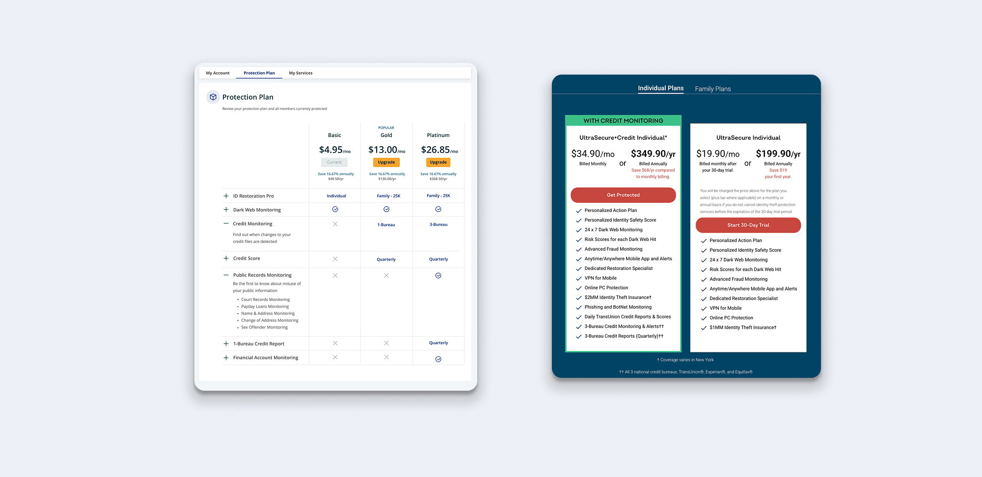
Before State: Plan Structures
Platform A – Structured Plan Architecture
- Plans are arranged in a single linear progression (e.g., Basic → Plus → Premium)
- Features are structured—each can be marked as included or not and assigned a specific value or variation by plan
- Structured data supports comparative views (e.g., feature grids)
- Each feature includes stored copy for consistent descriptions
- Architecture allows for easy visualization and scale
Platform B – Categorized, Unstructured Plans
- Plans are grouped into Individual and Family categories
- No structured hierarchy between plans—users are not funneled toward upgrades
- Feature sets are presented as freeform lists, unique to each plan
- No centralized definitions for features
- Side-by-side comparison is difficult due to lack of structure or shared schema
The Challenge
We needed to design a unified plan comparison experience that could work across two very different schemas — one highly structured with thousands of partner-specific plans (Platform A), and one simple, direct-to-consumer with minimal metadata (Platform B). The solution had to reduce variation for development, maintain usability across devices, and make plan differences clear at a glance.
Constraints
- Legacy systems from two merged products with different display logic
- Varying numbers of plans and unique plan feature sets
- Highly limited dev bandwidth for dynamic rendering logic
- Mobile-first expectations
- No time or resources for A/B testing on this version
- No dedicated product manager— scope and priorities required designer ownership
Goals
- Help users quickly understand differences between available plans
- Design a layout that scales from 2 to 5 plans without breaking
- Improve mobile usability compared to legacy graph-based designs
- Minimize development lift by leveraging existing component logic
Research & Insights
1. Internal Learnings
Some usability testing had previously been conducted on a related use case—an external-facing landing page for plan comparison—focused on evaluating user clarity and likelihood to purchase. The findings emphasized the importance of horizontally aligning plan features for easier scanning, defining any niche or jargon-heavy features, and avoiding dense graph-based designs, which proved difficult to interpret on mobile.
- Horizontal alignment improves scannability
- Defined features help users interpret jargon
- Graph-based designs didn’t translate well to mobile
2. Competitive Review
I analyzed competitor plan comparison experiences—focusing specifically on public landing pages rather than logged-in views. My goal was to identify interaction patterns that support mobile comparison, even when plans vary in structure and complexity.
What I found helpful:
- Clear horizontal alignment between plans made differences easier to scan
- Consistent visual rhythm helps compare plans
- Scrollable areas were most effective when affordance was obvious and available via multiple paths (swipe, tap)
Common Patterns:
- Most competitors used a long card layout with all plan features listed vertically
- One used a comparison grid, which worked well on desktop but posed challenges on mobile (e.g. overflow, cramped data)
- Most didn’t show what was *missing* from each plan
These insights informed my decision to explore hybrid solutions that maintained clarity while respecting mobile constraints.
3. Mobile Patterns Analysis
To better understand how users interact with plan comparisons on mobile, I conducted an informal audit of mobile experiences across industries. I was looking for patterns that made comparison intuitive, scannable, and visually clear—especially in contexts with limited screen real estate and high cognitive load.
What I noticed:
- Some forced users to toggle between entirely separate screens
- Most didn’t show what was *missing* from each plan
- Confirmed need for a hybrid approach that prioritized both clarity and comparison
Iterating Solutions
I explored several layout options, which I presented to the team as high-fidelity mocks due to internal expectations and the nature of our design process. I began with mobile-first layouts, as that was both the greatest area of usability concern and aligned with industry best practices.
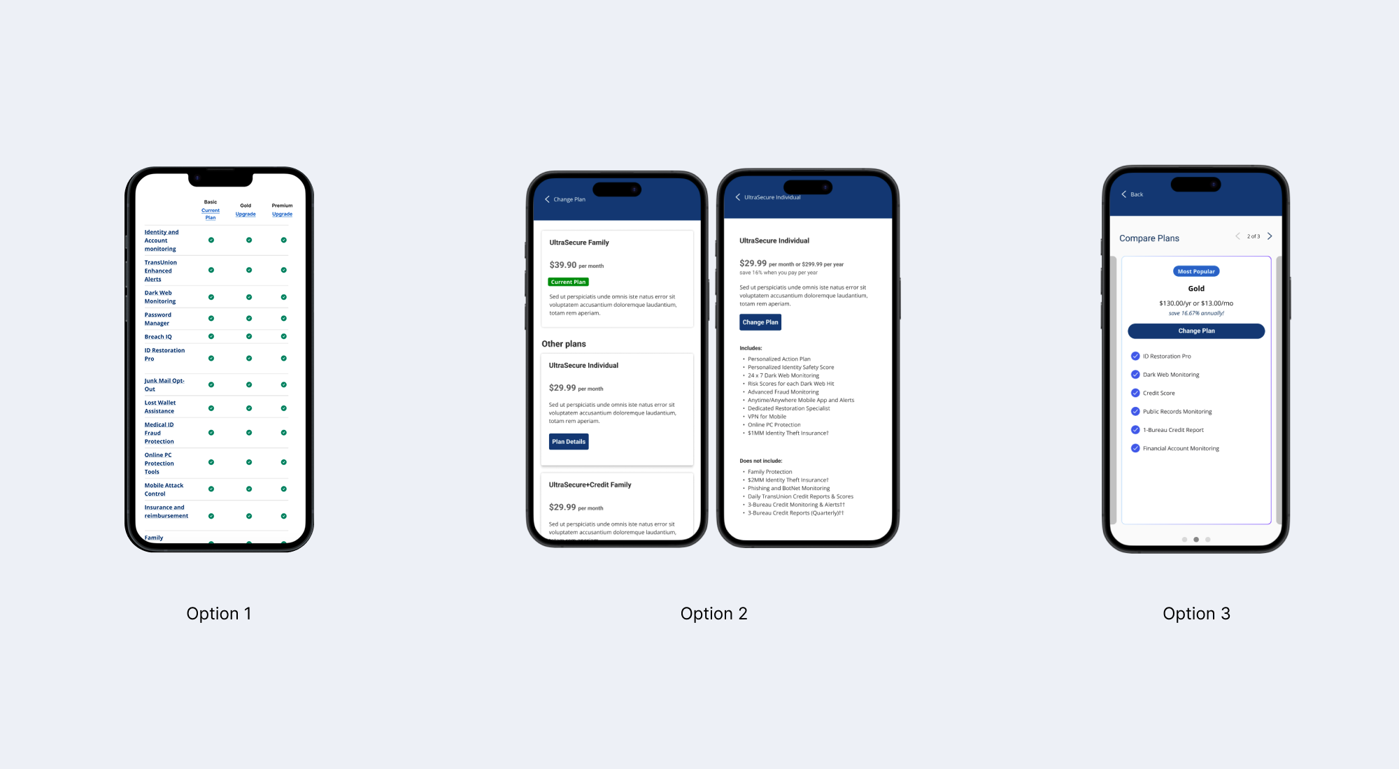
Option 1: Grid View on Mobile ❌
While visually clean, the grid could only display a maximum of three plans on smaller screens. This posed a major usability issue, as our requirements called for accommodating up to five. Arrows or pagination were considered but felt too subtle, risking discoverability issues.
Option 2: Stacked Vertical Cards ❌
This pattern scaled easily with the number of plans and offered parity with desktop, but made comparison difficult. Users would have had to tap into individual plan details and then navigate back repeatedly—creating excessive cognitive load. While this idea aligned with an internal request for parity across platforms, it failed to meet usability needs and was ultimately discarded.
Option 3: Long Feature Cards ❌
A standard pattern among competitors, long vertical cards list all included features for each plan. While familiar and implementation-friendly, it didn’t scale well across breakpoints. For desktop in particular, displaying multiple long cards side-by-side would result in poor readability or limited comparison. It also lacked visual hierarchy and made it hard to see what wasn’t included in each plan.
Final Solution: A Scalable, Unified Comparison Experience
The final design harmonizes the structural differences between Platform A and Platform B by uplifting Platform B’s simpler data into a consistent comparison layout. This allowed us to support both richly structured and minimal plan data within a single, scalable UI — without increasing development complexity on the structured side. The interface adapts from 2 to 5 plans gracefully, improves mobile navigation through horizontal swipe, and reduces user effort in comparing options at a glance.
Design Decisions That Drive Clarity
- Full-width card carousel: Users can swipe horizontally or tap arrows to browse plans without losing context on smaller screens.
- Clear selection feedback: The selected plan is highlighted with a colored stroke, a selected radio button, and a downward caret that visually connects it to the feature list below.
- Dynamic feature title: The section title updates to reflect the currently selected plan, reinforcing the relationship between the card and the content.
- Improved feature visibility: The list format shows both included and missing features, helping users understand trade-offs without excessive scrolling.
- List replaces legacy graph: Replacing the graph-based layout with a structured list enhances mobile usability and avoids interaction issues some phones have with horizontal graphs.
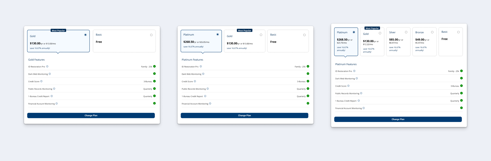
UI adapts seamlessly to 2, 3, and 5 plans
A responsive grid layout ensures the comparison remains balanced, legible, and scannable at any plan count. This flexibility supports a consistent experience without requiring separate designs for different configurations.
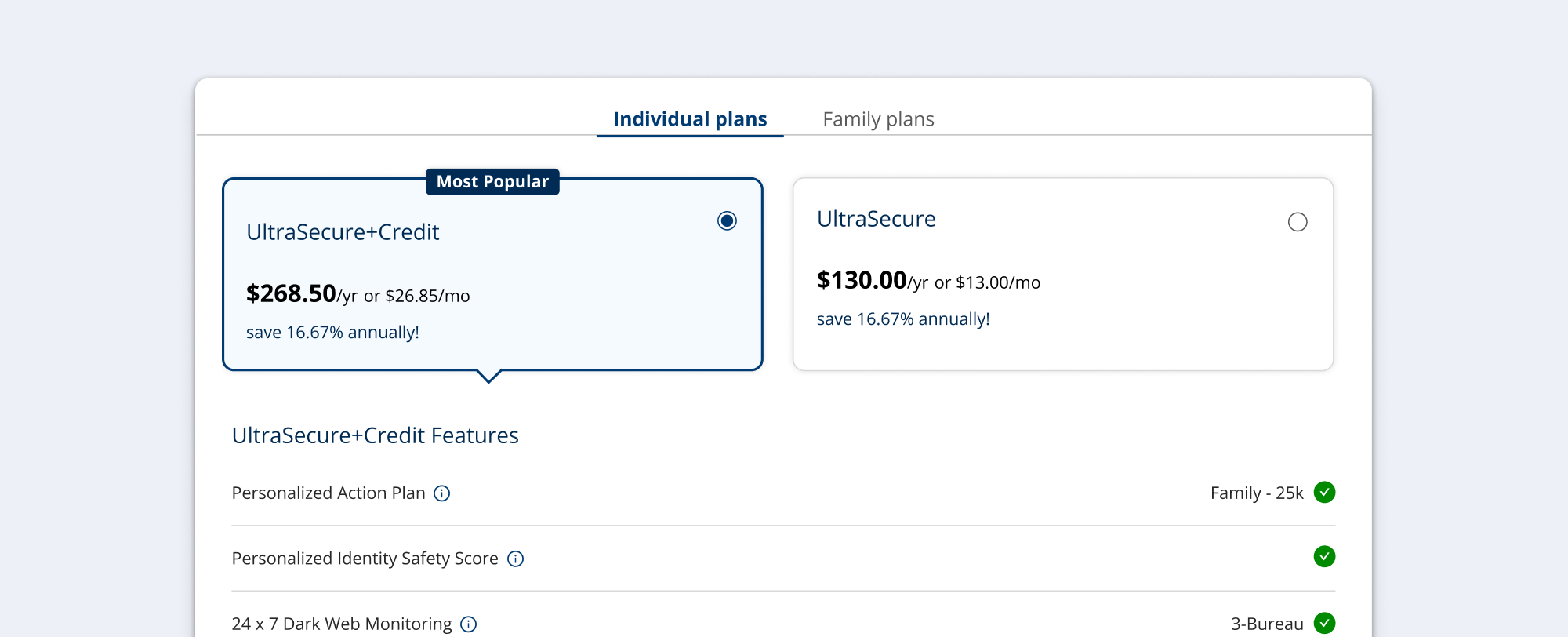
Supporting both linear and categorized plans
Here's an example where the plans aren't laid out in a simple linear progression. Instead, they're grouped into categories, Individual and Family, and need to be separated into tabs. A small detail, but I'm including it here since it was one of the structural challenges noted at the top.
Reflections
Designing this system reinforced the importance of planning for edge cases and scalability in complex products. While I had some input from a product manager, there wasn’t dedicated ownership on this project, so I often had to balance scope and priorities independently. That experience strengthened my ability to navigate ambiguity and make tradeoffs when constraints weren’t clearly defined.
Due to bandwidth limitations, we couldn’t conduct user testing — in hindsight, this would have been most valuable for validating how users navigate between categories and interpret feature differences.
Ultimately, success meant delivering a flexible system that worked across divergent schemas and could be handed off smoothly to development. The project sharpened my approach to designing adaptable systems and increased my confidence in leading through resource and organizational constraints.