.png)
Action Plan: Redesigning Identity Protection Recommendations
The action plan is a feature that helps users respond to identity threats.
Problem
Low engagement with action plan feature and confusing UX prevented it from being a competitive differentiator for B2B2C partners
Role
Lead designer conducting research synthesis, creating wireframes & prototypes, facilitating cross-functional collaboration, and conducting concept testing & iterating
Outcome
Contributed to multimillion-dollar enterprise deal. Launching Q4 2025, defined post-launch metrics framework
Identifying this as an opportunity
I performed a heuristic audit of our recently acquired identity protection app and a competitive analysis. I identified that the action plan could be a differentiator—but in its current state, it wasn't working. I communicated this finding to my director early on, and it shaped our strategy with B2B2C partners and marketing. He commissioned a diary study, which I helped synthesize. That research became the foundation for the redesign.
Diary Study


-1.png)
This study was designed and led by our UX researcher; I contributed by synthesizing findings and ensuring the implications shaped the alert redesign.
Heuristic analysis also revealed visibility of system status failures—the Action Plan lacked context about what risks users faced and why actions mattered, leaving users unable to assess their situation.
The Problem Visualized
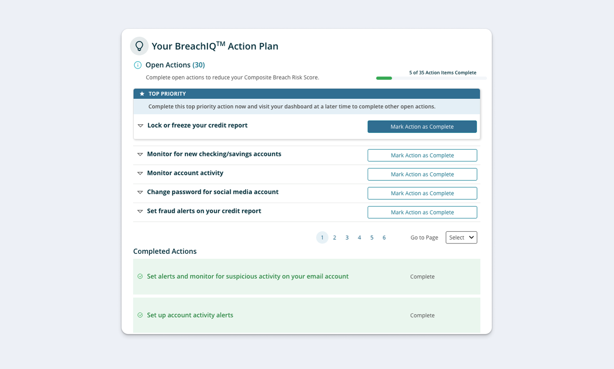
Here's what the action plan looked like when we inherited it. The action plan page holds a list of 40+ action items with no clear priority.
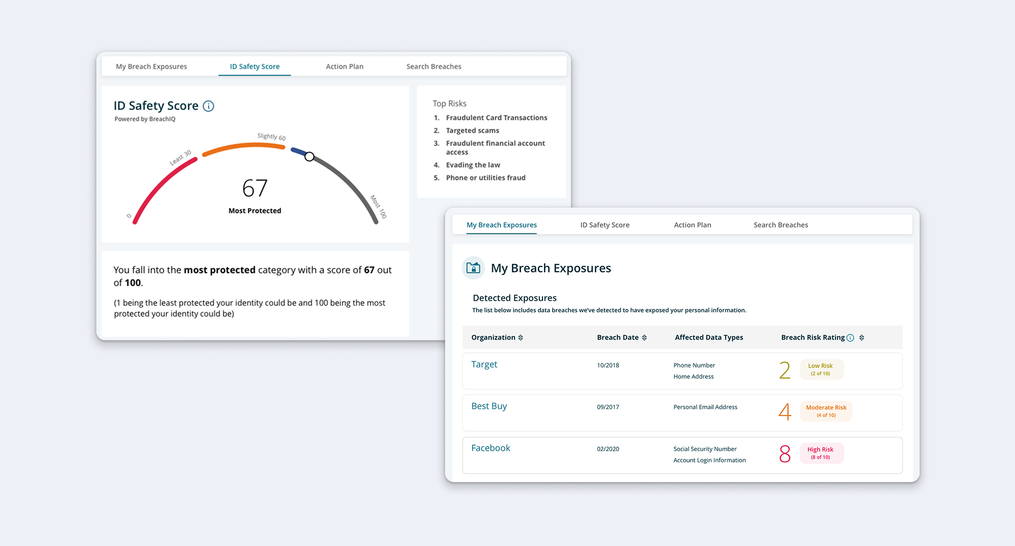
To ascertain the context for the action plan, users must navigate to separate tabs to access ID Safety Score, Top Risks, exposure history and exposed credentials. This separation makes it difficult for users to see the relevance of the recommendations and how those recommendations relate to their unique exposure history.
In the original design, the Action Plan was buried below the fold on the dashboard and not directly accessible from main navigation. Users struggled to locate the feature, reducing engagement and preventing it from fulfilling its purpose as a key differentiator.
Understanding the Problem Through Behavioral Design
Applying the Fogg Behavior Model revealed why users weren't acting on recommendations:
Low Motivation
Users didn't understand why they were at risk or why specific actions mattered. Without context connecting actions to their personal threat landscape, the feature felt generic and irrelevant.
Low Ability
The long, undifferentiated list made it unclear where to start or which actions were most important. Users faced high cognitive load with no clear entry point.
Weak Connection Between Prompt and Action
While alerts successfully triggered awareness of threats, they led to a generic action list with no obvious connection to the specific alert. Poor discoverability also meant users who wanted to find the Action Plan proactively struggled to locate it.
Design Process
Four design considerations guided my exploration:
- Organizing Long List of Tasks
- Content Placement and Context
- Communicating Risk
- Workflow Optimization
Organizing Long List of Tasks
The Challenge: Users faced an overwhelming, undifferentiated list of 20+ security actions with no clear prioritization or starting point.
The Approach: Stakeholders initially suggested grouping tasks as "critical" vs "proactive." After auditing the actions, I found this wouldn't work—only a handful qualified as proactive, while most would be labeled critical, which wouldn't reduce overwhelm.
I consulted with a data scientist to understand how the algorithm worked, and since actions were already tied to specific top risks in the algorithm, I could organize them by risk category—giving users a conceptual framework rather than an arbitrary list.
The Solution: I grouped actions by risk type (Credit Card Fraud, Tax Fraud, Account Takeover, etc.) and provided context about each risk before showing recommended actions. This transformed an overwhelming list into a structured, understandable system.
Content Placement and Context
The Challenge: Actions appeared without explanation of why users were at risk or how actions related to their specific threats.
The Approach: I needed to ensure the Action Plan was positioned alongside the context users needed to understand their risks—the ID Safety Score and exposure history. The question was how to structure this information so users could easily move between understanding their risk and taking action.
The Solution: I placed the Action Plan on the same page as the ID Safety Score and exposure data, allowing users to reference their risk level and breach history while reviewing recommended actions. Within each risk category, I provided risk descriptions and explanations of which exposed credentials created vulnerability.
"Am I at risk? How do you know? What should I do?" I structured each risk section to answer these questions in sequence—showing the score, exposure history, risk explanation, and then the action checklist all in one view.
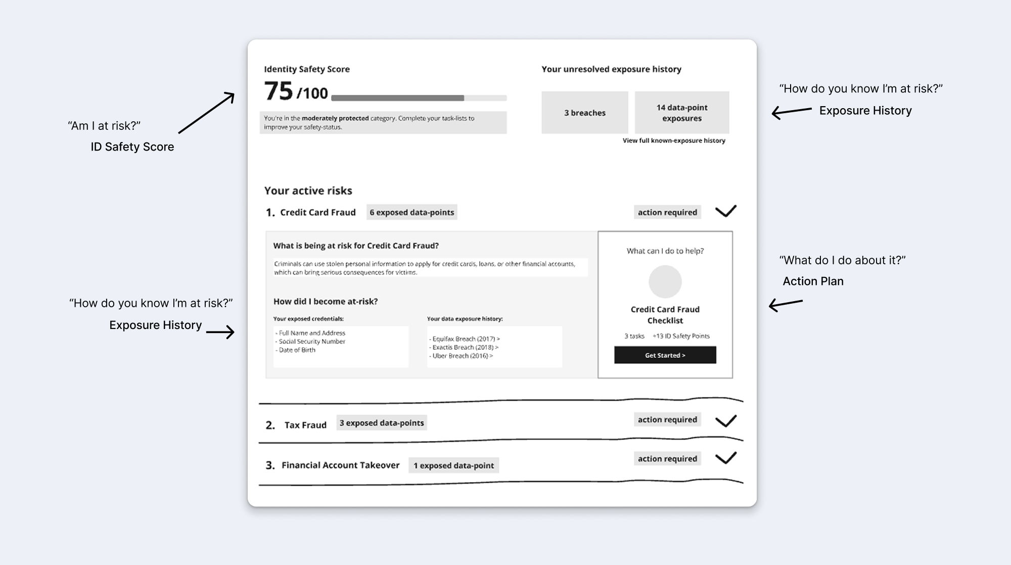
This keeps critical context accessible while users review actions, making recommendations feel personally relevant rather than generic.
Why this mattered: This addressed the low motivation barrier by keeping threat relevance clear. Users could verify why they were at risk while reviewing actions.
Communicating Risk
The Challenge: Users needed to understand which risks were most urgent so they could prioritize their efforts.
The Approach: I explored multiple ways to communicate risk severity:
- Number of exposed data points (quantifiable but not intuitive)
- Visual progress bars showing risk percentage
- Color-coded severity labels (severe/moderate/low likelihood)
Through rapid iteration, I tested different visual treatments to find what was most clear and motivating.
Solution: I communicated risk in terms of ID Safety Score impact—showing users how many points each risk represented and how completing actions would improve their score. This made risk measurable, transparent, and directly tied to a metric users could improve.
Workflow Optimization
The Challenge: Users needed to complete multiple tasks across different risk categories. How could we make this feel like a guided flow rather than isolated chores?
The Approach: I explored interaction patterns for:
- Task navigation (next/previous vs menu vs modal)
- Completion feedback (what happens when user marks a task complete?)
- Progress celebration (what happens when checklist is finished?)
The Solution: I designed a streamlined workflow where:
- Users can navigate tasks sequentially or jump to specific ones
- Completing a task shows immediate feedback and score impact
- Finishing a checklist provides celebration and shows updated risk status
- Users maintain flexibility in task order rather than forced linear progression
.png)
Usability Testing & Validation
Option A: Carousel-based grouping with top risks featured
Option B: Long scrolling list with no grouping but detailed score UI
Key findings:
- Testers preferred top-risk grouping (Option A) but found carousels clunky and obscured tasks
- Testers preferred more detailed score UI (Option B)
- Testers wanted autonomy in selecting actions rather than sequential navigation (Option B)
- No significant usability issues with either approach
Synthesis: I combined the risk-based grouping structure from Option A with the accordion interaction pattern and detailed scoring from Option B, creating a hybrid solution that addressed user preferences from both concepts.
Final Solution
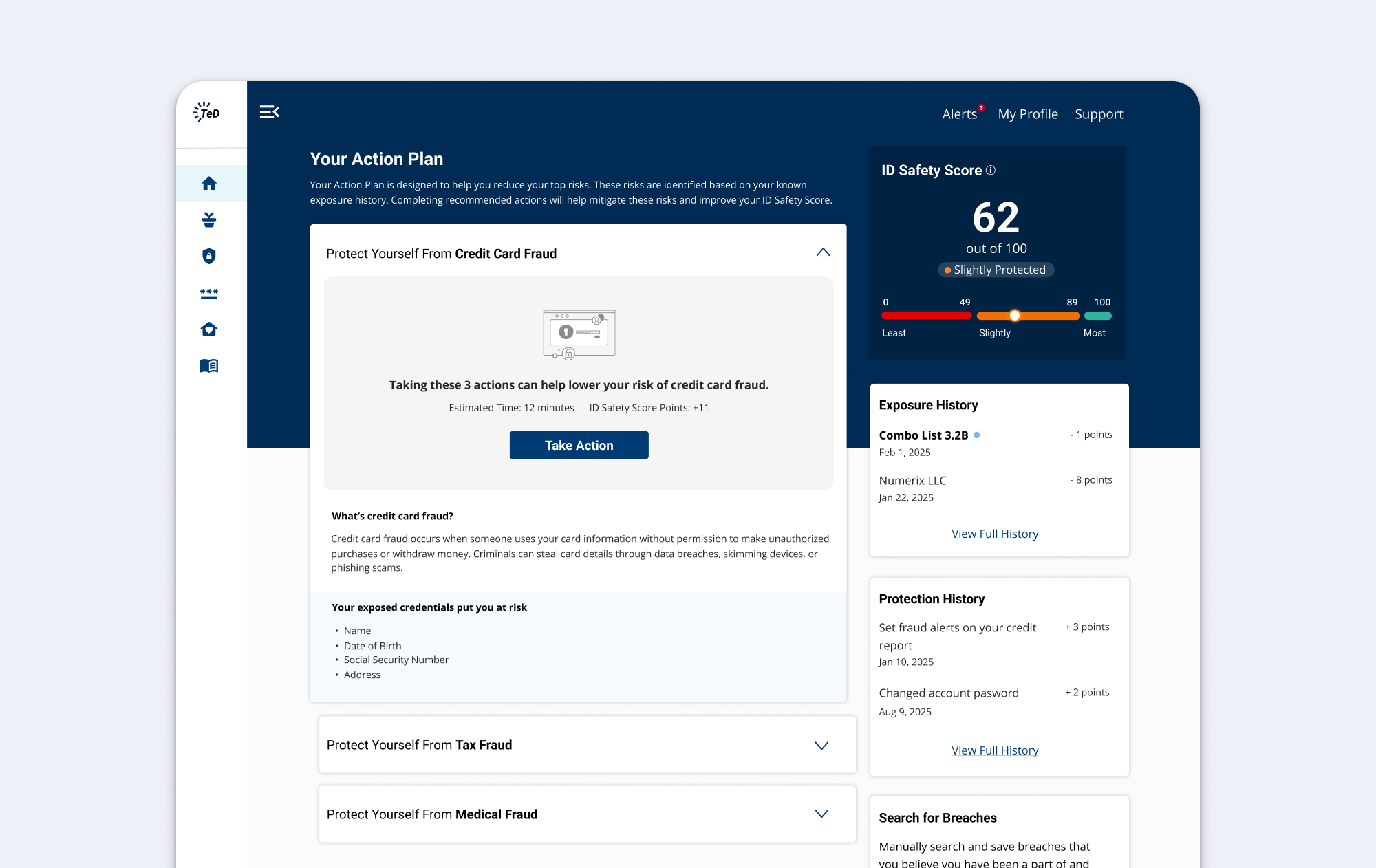
Risk-Based Organization with Context
Tasks are grouped by top risk (Credit Card Fraud, Tax Fraud, etc.) using accordions instead of carousels. Each risk section provides context about the threat and shows which exposed credentials created vulnerability before presenting actions.
Estimated time and ID Safety Score points appear with each action group, creating clear expectations and motivation to complete tasks.
Why this mattered: This addressed the low ability barrier by breaking an overwhelming list into meaningful categories, and the low motivation barrier by making threats personally relevant with clear impact visibility.
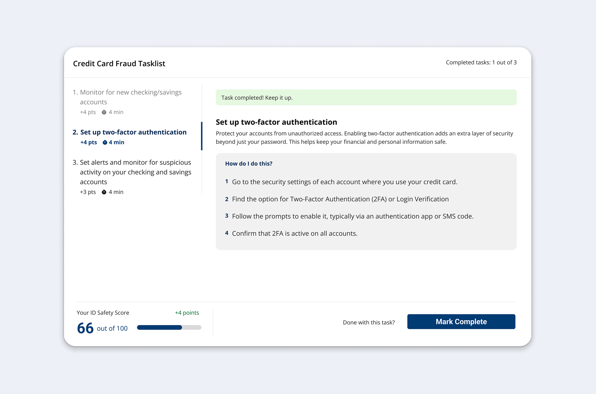
Focused Task Experience
Clicking "Take Action" leads to a focused, distraction-free task view. Users can navigate between tasks via tabs without losing context of which risk they're addressing. The ID Safety Score updates in real-time as tasks are completed, providing immediate feedback on progress.
Why this mattered: This maintained momentum by reducing cognitive load (focused view) while providing continuous reinforcement (score updates) that actions have tangible impact.
Measuring Success
Impact:
- Transformed a flat, contextless checklist into a transparent, guided system.
- Design strategy was adapted and integrated into white-label product by another designer during implementation.
- Design work contributed to sales presentations that secured purchase by a major bank, resulting in a multi-million-dollar contract.
Future KPIs:
- Page engagement → frequency and repeat visits to the Action Plan.
- Task completion → percentage of recommended actions users follow through on.
- Feature adoption → overall proportion of users engaging compared to the prior version.
- Embedded surveys → A quick "was this helpful" to collect targeted feedback.