
Alerts System
Problem
The legacy alert system overwhelmed users with technical details that heightened anxiety instead of helping. A diary study, in-app feedback, and heuristic review showed users struggled to interpret alerts and often turned to customer support. Compared to competitors, our product delivered far more raw content, burdening users with information they couldn’t act on.
Role & Collaboration
I led the UX and content strategy. I partnered with subject matter experts (API vendor, call center lead) to clarify what information mattered most, worked with our UX researcher to synthesize studies and feedback, ran a competitive audit, and mapped the user journey to capture functional and emotional pain points. I presented the strategy in an executive summary review with senior leadership, aligning stakeholders on the new direction.
Outcome & Impact
The redesign prioritizes essential content, aiming to lower support call volume and improve user confidence. This work established clear guidelines for structuring alerts going forward, ensuring future messages are concise, actionable, and user-centered.
Platform Context
What the App Does

- Monitors for suspicious activity across identity, credit, transactions, social media, and nearby registered sex-offenders.
- When a risk is detected, users receive an alert with details about the event and guidance on next steps.
- Additional features are available, but monitoring and alerts are the core focus.
Alert System Touchpoints

- These touchpoints make up the full user experience of the alerts system.
- While each touchpoint could be improved, this work focuses on the dashboard, individual messages, and alerts inbox.
Research Methods
Diary Study → uncovered confusion & anxiety
12 participants, 30 days
- 1:1 interviews to establish expectations of an Identity Protection application
- Unmonitored usage of real product
- Affinity mapping to analyze user quotes and identify common pain-points and sentiments
High-level insights
The diary study revealed fundamental expectations of an identity protection product as well as pain-points related to this expectation.
- Participants experienced fatigue with quantity of low-importance alerts and work required to navigate them.
- Perceived value of alerts dropped when advice was not clearly actionable.
In-App Feedback → validated issues at scale
There’s a form for open feedback where users can report bugs or voice UX pain-points.
- 100s of submissions a month
- Categorized and analyzed for common themes
High-level insights
Analysis of in-app feedback surfaced three major pain points related to the alerts system.
Too many unimportant alerts
Users ask for settings to turn off sex offender and low-risk dark web alerts.
Navigating alerts is cumbersome
- Users ask for ways to process alerts in bulk, rather than archive.
- Dislike having to click each one to review and then sort.
Guidance isn’t guiding
- “I got an alert from you, but I don’t know what to do about it.”
- “The alert message did not align with the actual steps in the app.”
Heuristic evaluation → flagged usability problems
Identified usability issues in the legacy alerts, including jargon-heavy language, poor content hierarchy, and information overload. These findings reinforced what we saw in user feedback and gave us concrete starting points for redesign.
Competitive audit → benchmarked industry practice
There’s a form for open feedback where users can report bugs or voice UX pain-points.
- API vendor → confirmed whether breach data could be tied to a company vs. a general data dump, helping us avoid surfacing noisy details users couldn’t act on.
- Call center lead → revealed the top questions anxious users called in about. This directly informed content strategy: surfacing clear reassurance up front to reduce support calls.
SME interviews → clarified essential content
Benchmarked alerting practices from peer products and found that our system disclosed far more raw data than others. This reinforced the need to focus on clarity and actionability over volume.
Key Problems
Together, these methods highlighted three consistent problems: information overload, unclear content hierarchy, and anxiety-triggering messages that led users to call support. These themes directly shaped the design strategy across individual messages, the inbox, and the dashboard.
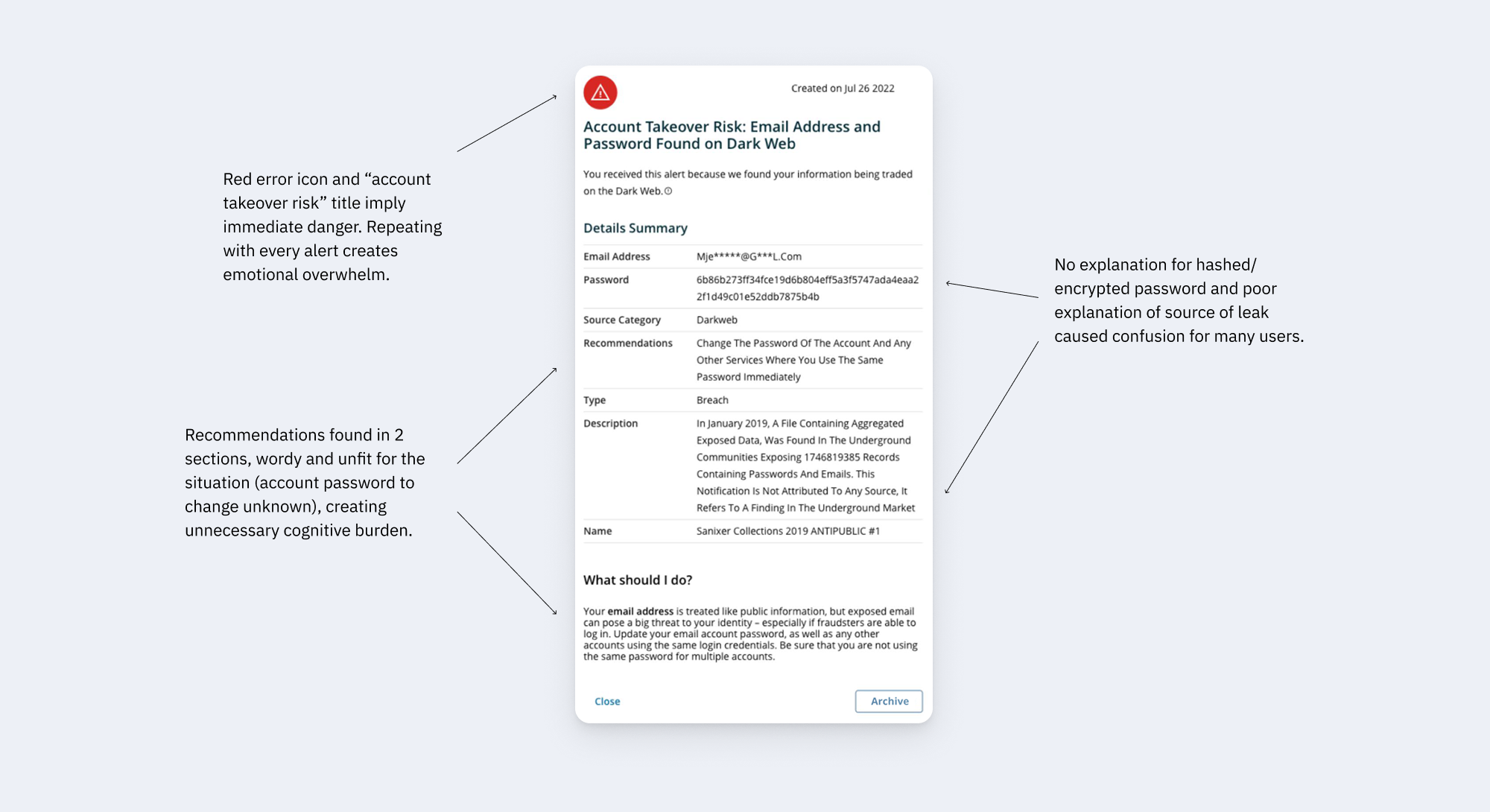
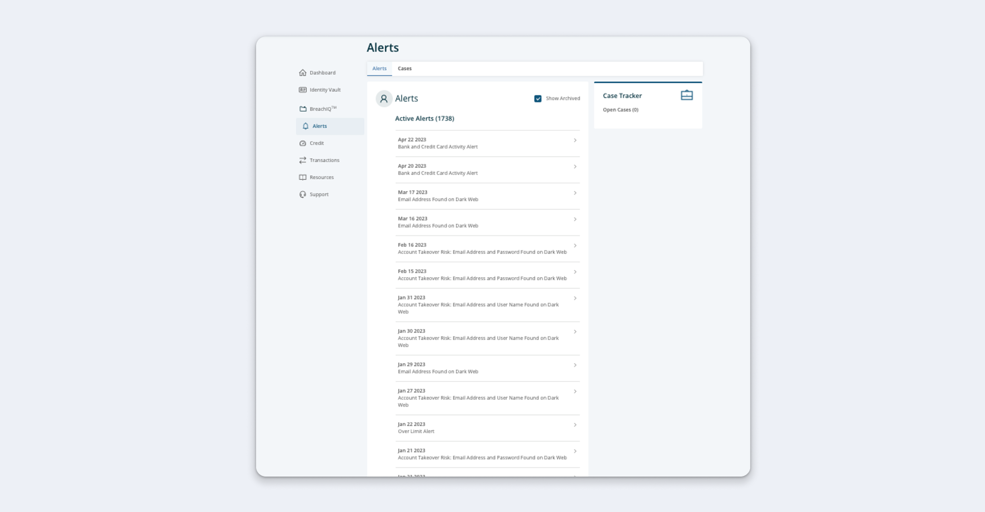
Alerts Inbox Before
Problem: The old inbox overwhelmed users with too many alerts and no meaningful way to manage them. The lack of read/unread states, pagination, or deletion options forced users to manually track what they had seen.
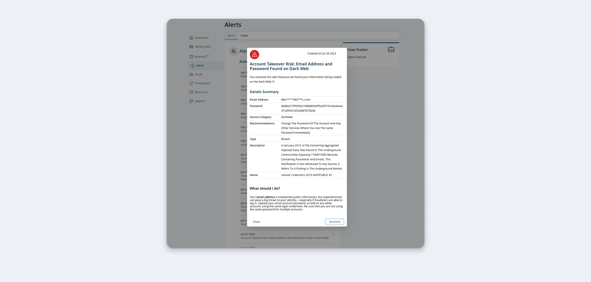
Alerts Inbox Before
Problem: The modal format disrupted navigation, forcing users to enter and exit repeatedly when reviewing multiple alerts. With only an archive option (and no read/unread or deletion), users were left without a clear system to organize or sort their notices.
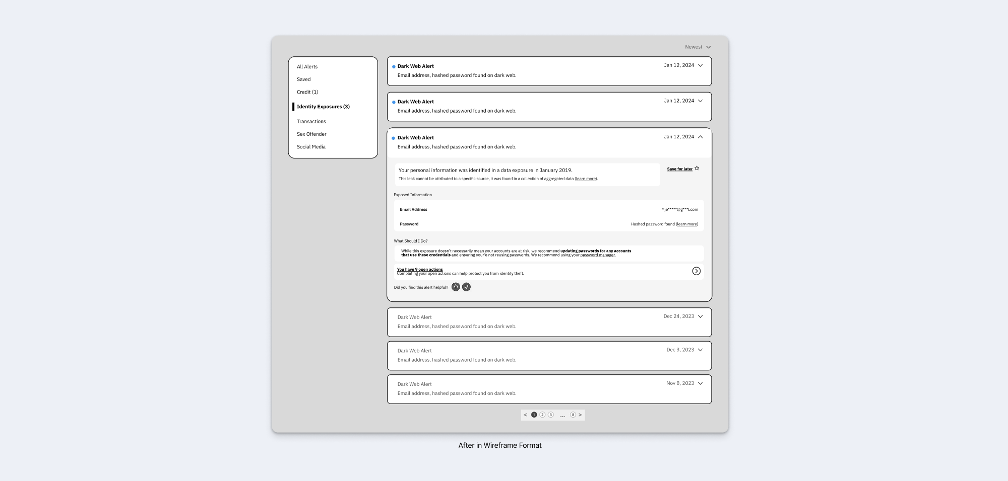
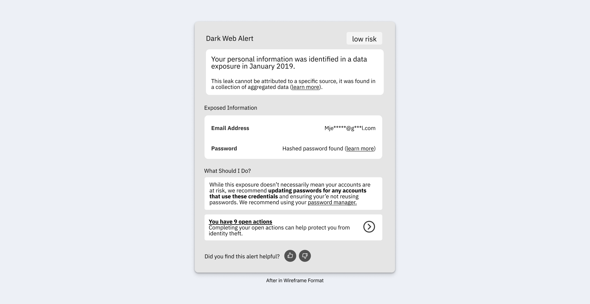
Outcome: The new design simplifies navigation with expandable cards instead of disruptive modals and introduces read/unread states, pagination, and tabs to make scanning easier. Users also have flexible options to manage alerts, including a save feature for notices of interest, eliminating the sorting ambiguity of the old archive-only system.
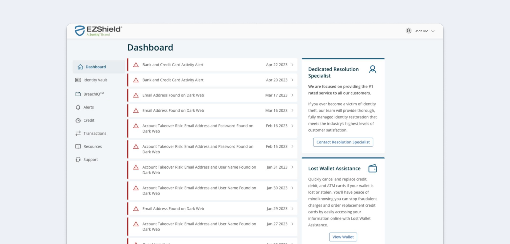
Dashboard Before
Problem: The dashboard was cluttered with numerous alerts displayed as mini-cards with red warning signs, occupying a prime space that detracted from other important information. This made the dashboard feel overwhelming and especially difficult to navigate.
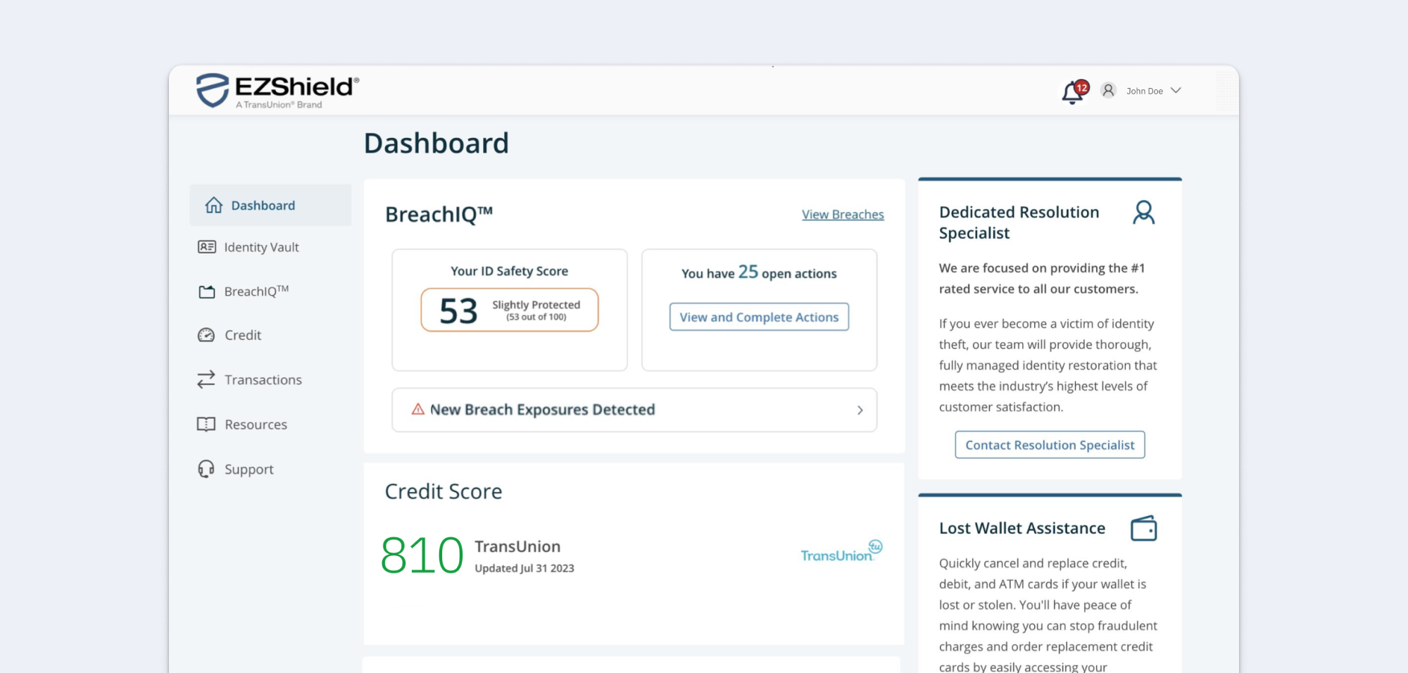
Dashboard After
Outcome: Alerts are now consolidated into a simple notification icon in the top right corner, showing the number of active alerts. This keeps the dashboard cleaner and more focused, freeing up space for more relevant data.
Reflections & Next Steps
This strategy was adopted for development of the consolidated platform, where alerts and related flows are being rebuilt. Once implemented, success can be evaluated through a combination of engagement and sentiment metrics:
- Retention & platform usage → Track whether free users engage more consistently post-launch, since effective alerts are a core value driver.
- In-app surveys → Collect user sentiment with quick thumbs-up/down feedback and optional comments to measure clarity and trust in alerts.
- Interaction patterns → Analyze how users engage with saved or prioritized alerts to confirm that the most relevant information is surfaced first.
These measures will help validate whether the redesigned alerts reduce fatigue, increase confidence, and strengthen the overall value of the platform.